React Card - Flowbite
Get started with the card component to show content in a box such as titles, descriptions, and images based on multiple styles and sizes built with React
The card component can be used to show a wide variety of content such as previews of blog posts, user profiles, pricing plans, and more. Choose from one of the many examples built with React and the utility classes from Tailwind CSS.
To start using the card component you will need to import it from flowbite-react:
import { Card } from "flowbite-react";
Default card#
Use this example to show a simple card component with a title and description and apply the href tag to the <Card> component to set a hyperlink to the card.
import { Card } from "flowbite-react";

export function Component() {
  return (
    <Card href="#" className="max-w-sm">
      <h5 className="text-2xl font-bold tracking-tight text-gray-900 dark:text-white">
        Noteworthy technology acquisitions 2021
      </h5>
      <p className="font-normal text-gray-700 dark:text-gray-400">
        Here are the biggest enterprise technology acquisitions of 2021 so far, in reverse chronological order.
      </p>
    </Card>
  );
}
Card with CTA button#
By also importing the <Button> component you can add it inside the card to show a call to action button.
Noteworthy technology acquisitions 2021
Here are the biggest enterprise technology acquisitions of 2021 so far, in reverse chronological order.
import { Button, Card } from "flowbite-react";

export function Component() {
  return (
    <Card className="max-w-sm">
      <h5 className="text-2xl font-bold tracking-tight text-gray-900 dark:text-white">
        Noteworthy technology acquisitions 2021
      </h5>
      <p className="font-normal text-gray-700 dark:text-gray-400">
        Here are the biggest enterprise technology acquisitions of 2021 so far, in reverse chronological order.
      </p>
      <Button>
        Read more
        <svg className="-mr-1 ml-2 h-4 w-4" fill="currentColor" viewBox="0 0 20 20" xmlns="http://www.w3.org/2000/svg">
          <path
            fillRule="evenodd"
            d="M10.293 3.293a1 1 0 011.414 0l6 6a1 1 0 010 1.414l-6 6a1 1 0 01-1.414-1.414L14.586 11H3a1 1 0 110-2h11.586l-4.293-4.293a1 1 0 010-1.414z"
            clipRule="evenodd"
          />
        </svg>
      </Button>
    </Card>
  );
}Card with image#
Add an image to the card by using the imgSrc prop and set the imgAlt prop to add an alt text to the image.

Noteworthy technology acquisitions 2021
Here are the biggest enterprise technology acquisitions of 2021 so far, in reverse chronological order.
import { Card } from "flowbite-react";

export function Component() {
  return (
    <Card
      className="max-w-sm"
      imgAlt="Meaningful alt text for an image that is not purely decorative"
      imgSrc="/images/blog/image-1.jpg"
    >
      <h5 className="text-2xl font-bold tracking-tight text-gray-900 dark:text-white">
        Noteworthy technology acquisitions 2021
      </h5>
      <p className="font-normal text-gray-700 dark:text-gray-400">
        Here are the biggest enterprise technology acquisitions of 2021 so far, in reverse chronological order.
      </p>
    </Card>
  );
}Card with custom image render function#
Specify your own render function for the image component for the card by using the renderImage prop. This is especially useful when
using the component with NextJS or Gatsby.

Noteworthy technology acquisitions 2021
Here are the biggest enterprise technology acquisitions of 2021 so far, in reverse chronological order.
"use client";

import { Card } from "flowbite-react";
import Image from "next/image";

export function Component() {
  return (
    <Card
      className="max-w-sm"
      renderImage={() => <Image width={500} height={500} src="/images/blog/image-1.jpg" alt="image 1" />}
    >
      <h5 className="text-2xl font-bold tracking-tight text-gray-900 dark:text-white">
        Noteworthy technology acquisitions 2021
      </h5>
      <p className="font-normal text-gray-700 dark:text-gray-400">
        Here are the biggest enterprise technology acquisitions of 2021 so far, in reverse chronological order.
      </p>
    </Card>
  );
}Horizontal card#
Use the horizontal prop to show the card in a horizontal layout.
import { Card } from "flowbite-react";

export function Component() {
  return (
    <Card className="max-w-sm" imgSrc="/images/blog/image-4.jpg" horizontal>
      <h5 className="text-2xl font-bold tracking-tight text-gray-900 dark:text-white">
        Noteworthy technology acquisitions 2021
      </h5>
      <p className="font-normal text-gray-700 dark:text-gray-400">
        Here are the biggest enterprise technology acquisitions of 2021 so far, in reverse chronological order.
      </p>
    </Card>
  );
}
User profile card#
Use this example to show a user card with a profile picture, name, job title, buttons and a dropdown menu.

import { Card, Dropdown, DropdownItem } from "flowbite-react";
import Image from "next/image";

export function Component() {
  return (
    <Card className="max-w-sm">
      <div className="flex justify-end px-4 pt-4">
        <Dropdown inline label="">
          <DropdownItem>
            <a
              href="#"
              className="block px-4 py-2 text-sm text-gray-700 hover:bg-gray-100 dark:text-gray-200 dark:hover:bg-gray-600 dark:hover:text-white"
            >
              Edit
            </a>
          </DropdownItem>
          <DropdownItem>
            <a
              href="#"
              className="block px-4 py-2 text-sm text-gray-700 hover:bg-gray-100 dark:text-gray-200 dark:hover:bg-gray-600 dark:hover:text-white"
            >
              Export Data
            </a>
          </DropdownItem>
          <DropdownItem>
            <a
              href="#"
              className="block px-4 py-2 text-sm text-red-600 hover:bg-gray-100 dark:text-gray-200 dark:hover:bg-gray-600 dark:hover:text-white"
            >
              Delete
            </a>
          </DropdownItem>
        </Dropdown>
      </div>
      <div className="flex flex-col items-center pb-10">
        <Image
          alt="Bonnie image"
          height="96"
          src="/images/people/profile-picture-3.jpg"
          width="96"
          className="mb-3 rounded-full shadow-lg"
        />
        <h5 className="mb-1 text-xl font-medium text-gray-900 dark:text-white">Bonnie Green</h5>
        <span className="text-sm text-gray-500 dark:text-gray-400">Visual Designer</span>
        <div className="mt-4 flex space-x-3 lg:mt-6">
          <a
            href="#"
            className="inline-flex items-center rounded-lg bg-cyan-700 px-4 py-2 text-center text-sm font-medium text-white hover:bg-cyan-800 focus:outline-none focus:ring-4 focus:ring-cyan-300 dark:bg-cyan-600 dark:hover:bg-cyan-700 dark:focus:ring-cyan-800"
          >
            Add friend
          </a>
          <a
            href="#"
            className="inline-flex items-center rounded-lg border border-gray-300 bg-white px-4 py-2 text-center text-sm font-medium text-gray-900 hover:bg-gray-100 focus:outline-none focus:ring-4 focus:ring-gray-200 dark:border-gray-600 dark:bg-gray-800 dark:text-white dark:hover:border-gray-700 dark:hover:bg-gray-700 dark:focus:ring-gray-700"
          >
            Message
          </a>
        </div>
      </div>
    </Card>
  );
}Card with form#
You can also add form elements inside of the card component such as for sign up or login forms.
import { Button, Card, Checkbox, Label, TextInput } from "flowbite-react";

export function Component() {
  return (
    <Card className="max-w-sm">
      <form className="flex flex-col gap-4">
        <div>
          <div className="mb-2 block">
            <Label htmlFor="email1">Your email</Label>
          </div>
          <TextInput id="email1" type="email" placeholder="[email protected]" required />
        </div>
        <div>
          <div className="mb-2 block">
            <Label htmlFor="password1">Your password</Label>
          </div>
          <TextInput id="password1" type="password" required />
        </div>
        <div className="flex items-center gap-2">
          <Checkbox id="remember" />
          <Label htmlFor="remember">Remember me</Label>
        </div>
        <Button type="submit">Submit</Button>
      </form>
    </Card>
  );
}E-commerce card#
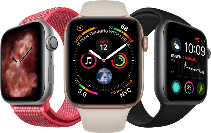
Use this example to show a product card with an image (product preview), title, price, rating stars and buttons built for E-commerce websites.
import { Card } from "flowbite-react";

export function Component() {
  return (
    <Card
      className="max-w-sm"
      imgAlt="Apple Watch Series 7 in colors pink, silver, and black"
      imgSrc="/images/products/apple-watch.png"
    >
      <a href="#">
        <h5 className="text-xl font-semibold tracking-tight text-gray-900 dark:text-white">
          Apple Watch Series 7 GPS, Aluminium Case, Starlight Sport
        </h5>
      </a>
      <div className="mb-5 mt-2.5 flex items-center">
        <svg
          className="h-5 w-5 text-yellow-300"
          fill="currentColor"
          viewBox="0 0 20 20"
          xmlns="http://www.w3.org/2000/svg"
        >
          <path d="M9.049 2.927c.3-.921 1.603-.921 1.902 0l1.07 3.292a1 1 0 00.95.69h3.462c.969 0 1.371 1.24.588 1.81l-2.8 2.034a1 1 0 00-.364 1.118l1.07 3.292c.3.921-.755 1.688-1.54 1.118l-2.8-2.034a1 1 0 00-1.175 0l-2.8 2.034c-.784.57-1.838-.197-1.539-1.118l1.07-3.292a1 1 0 00-.364-1.118L2.98 8.72c-.783-.57-.38-1.81.588-1.81h3.461a1 1 0 00.951-.69l1.07-3.292z" />
        </svg>
        <span className="ml-3 mr-2 rounded bg-cyan-100 px-2.5 py-0.5 text-xs font-semibold text-cyan-800 dark:bg-cyan-200 dark:text-cyan-800">
          5.0
        </span>
      </div>
      <div className="flex items-center justify-between">
        <span className="text-3xl font-bold text-gray-900 dark:text-white">$599</span>
        <a
          href="#"
          className="rounded-lg bg-cyan-700 px-5 py-2.5 text-center text-sm font-medium text-white hover:bg-cyan-800 focus:outline-none focus:ring-4 focus:ring-cyan-300 dark:bg-cyan-600 dark:hover:bg-cyan-700 dark:focus:ring-cyan-800"
        >
          Add to cart
        </a>
      </div>
    </Card>
  );
}CTA card#
Use this component to display a call to action card for mobile applications where you feature download buttons for App Store and Google Play.
Work fast from anywhere
Stay up to date and move work forward with Flowbite on iOS & Android. Download the app today.
import { Card } from "flowbite-react";

export function Component() {
  return (
    <Card className="max-w-sm">
      <h5 className="mb-2 text-3xl font-bold text-gray-900 dark:text-white">Work fast from anywhere</h5>
      <p className="mb-5 text-base text-gray-500 sm:text-lg dark:text-gray-400">
        Stay up to date and move work forward with Flowbite on iOS & Android. Download the app today.
      </p>
      <div className="items-center justify-center space-y-4 sm:flex sm:space-x-4 sm:space-y-0">
        <a
          href="#"
          className="inline-flex w-full items-center justify-center rounded-lg bg-gray-800 px-4 py-2.5 text-white hover:bg-gray-700 focus:outline-none focus:ring-4 focus:ring-gray-300 sm:w-auto dark:bg-gray-700 dark:hover:bg-gray-600 dark:focus:ring-gray-700"
        >
          <svg
            className="mr-3 h-7 w-7"
            aria-hidden="true"
            focusable="false"
            data-prefix="fab"
            data-icon="apple"
            role="img"
            xmlns="http://www.w3.org/2000/svg"
            viewBox="0 0 384 512"
          >
            <path
              fill="currentColor"
              d="M318.7 268.7c-.2-36.7 16.4-64.4 50-84.8-18.8-26.9-47.2-41.7-84.7-44.6-35.5-2.8-74.3 20.7-88.5 20.7-15 0-49.4-19.7-76.4-19.7C63.3 141.2 4 184.8 4 273.5q0 39.3 14.4 81.2c12.8 36.7 59 126.7 107.2 125.2 25.2-.6 43-17.9 75.8-17.9 31.8 0 48.3 17.9 76.4 17.9 48.6-.7 90.4-82.5 102.6-119.3-65.2-30.7-61.7-90-61.7-91.9zm-56.6-164.2c27.3-32.4 24.8-61.9 24-72.5-24.1 1.4-52 16.4-67.9 34.9-17.5 19.8-27.8 44.3-25.6 71.9 26.1 2 49.9-11.4 69.5-34.3z"
            />
          </svg>
          <div className="text-left">
            <div className="mb-1 text-xs">Download on the</div>
            <div className="-mt-1 font-sans text-sm font-semibold">Mac App Store</div>
          </div>
        </a>
        <a
          href="#"
          className="inline-flex w-full items-center justify-center rounded-lg bg-gray-800 px-4 py-2.5 text-white hover:bg-gray-700 focus:outline-none focus:ring-4 focus:ring-gray-300 sm:w-auto dark:bg-gray-700 dark:hover:bg-gray-600 dark:focus:ring-gray-700"
        >
          <svg
            className="mr-3 h-7 w-7"
            aria-hidden="true"
            focusable="false"
            data-prefix="fab"
            data-icon="google-play"
            role="img"
            xmlns="http://www.w3.org/2000/svg"
            viewBox="0 0 512 512"
          >
            <path
              fill="currentColor"
              d="M325.3 234.3L104.6 13l280.8 161.2-60.1 60.1zM47 0C34 6.8 25.3 19.2 25.3 35.3v441.3c0 16.1 8.7 28.5 21.7 35.3l256.6-256L47 0zm425.2 225.6l-58.9-34.1-65.7 64.5 65.7 64.5 60.1-34.1c18-14.3 18-46.5-1.2-60.8zM104.6 499l280.8-161.2-60.1-60.1L104.6 499z"
            />
          </svg>
          <div className="text-left">
            <div className="mb-1 text-xs">Get in on</div>
            <div className="-mt-1 font-sans text-sm font-semibold">Google Play</div>
          </div>
        </a>
      </div>
    </Card>
  );
}Card with list#
Use this component to display a card with a list of items such as your latest customers or latest orders that include an image, descriptive text and a link to view more.
Latest Customers
View all
import { Card } from "flowbite-react";
import Image from "next/image";

export function Component() {
  return (
    <Card className="max-w-sm">
      <div className="mb-4 flex items-center justify-between">
        <h5 className="text-xl font-bold leading-none text-gray-900 dark:text-white">Latest Customers</h5>
        <a href="#" className="text-sm font-medium text-cyan-600 hover:underline dark:text-cyan-500">
          View all
        </a>
      </div>
      <div className="flow-root">
        <ul className="divide-y divide-gray-200 dark:divide-gray-700">
          <li className="py-3 sm:py-4">
            <div className="flex items-center space-x-4">
              <div className="shrink-0">
                <Image
                  alt="Neil image"
                  height="32"
                  src="/images/people/profile-picture-1.jpg"
                  width="32"
                  className="rounded-full"
                />
              </div>
              <div className="min-w-0 flex-1">
                <p className="truncate text-sm font-medium text-gray-900 dark:text-white">Neil Sims</p>
                <p className="truncate text-sm text-gray-500 dark:text-gray-400">[email protected]</p>
              </div>
              <div className="inline-flex items-center text-base font-semibold text-gray-900 dark:text-white">$320</div>
            </div>
          </li>
          <li className="py-3 sm:py-4">
            <div className="flex items-center space-x-4">
              <div className="shrink-0">
                <Image
                  alt="Bonnie image"
                  height="32"
                  src="/images/people/profile-picture-3.jpg"
                  width="32"
                  className="rounded-full"
                />
              </div>
              <div className="min-w-0 flex-1">
                <p className="truncate text-sm font-medium text-gray-900 dark:text-white">Bonnie Green</p>
                <p className="truncate text-sm text-gray-500 dark:text-gray-400">[email protected]</p>
              </div>
              <div className="inline-flex items-center text-base font-semibold text-gray-900 dark:text-white">
                $3467
              </div>
            </div>
          </li>
          <li className="py-3 sm:py-4">
            <div className="flex items-center space-x-4">
              <div className="shrink-0">
                <Image
                  alt="Michael image"
                  height="32"
                  src="/images/people/profile-picture-2.jpg"
                  width="32"
                  className="rounded-full"
                />
              </div>
              <div className="min-w-0 flex-1">
                <p className="truncate text-sm font-medium text-gray-900 dark:text-white">Michael Gough</p>
                <p className="truncate text-sm text-gray-500 dark:text-gray-400">[email protected]</p>
              </div>
              <div className="inline-flex items-center text-base font-semibold text-gray-900 dark:text-white">$67</div>
            </div>
          </li>
          <li className="py-3 sm:py-4">
            <div className="flex items-center space-x-4">
              <div className="shrink-0">
                <Image
                  alt="Lana image"
                  height="32"
                  src="/images/people/profile-picture-4.jpg"
                  width="32"
                  className="rounded-full"
                />
              </div>
              <div className="min-w-0 flex-1">
                <p className="truncate text-sm font-medium text-gray-900 dark:text-white">Lana Byrd</p>
                <p className="truncate text-sm text-gray-500 dark:text-gray-400">[email protected]</p>
              </div>
              <div className="inline-flex items-center text-base font-semibold text-gray-900 dark:text-white">$367</div>
            </div>
          </li>
          <li className="pb-0 pt-3 sm:pt-4">
            <div className="flex items-center space-x-4">
              <div className="shrink-0">
                <Image
                  alt="Thomas image"
                  height="32"
                  src="/images/people/profile-picture-5.jpg"
                  width="32"
                  className="rounded-full"
                />
              </div>
              <div className="min-w-0 flex-1">
                <p className="truncate text-sm font-medium text-gray-900 dark:text-white">Thomes Lean</p>
                <p className="truncate text-sm text-gray-500 dark:text-gray-400">[email protected]</p>
              </div>
              <div className="inline-flex items-center text-base font-semibold text-gray-900 dark:text-white">
                $2367
              </div>
            </div>
          </li>
        </ul>
      </div>
    </Card>
  );
}Pricing card#
Use the pricing card component to show the pricing of your product or service.
Standard plan
- 2 team members
- 20GB Cloud storage
- Integration help
- Sketch Files
- API Access
- Complete documentation
- 24×7 phone & email support
import { Card } from "flowbite-react";

export function Component() {
  return (
    <Card className="max-w-sm">
      <h5 className="mb-4 text-xl font-medium text-gray-500 dark:text-gray-400">Standard plan</h5>
      <div className="flex items-baseline text-gray-900 dark:text-white">
        <span className="text-3xl font-semibold">$</span>
        <span className="text-5xl font-extrabold tracking-tight">49</span>
        <span className="ml-1 text-xl font-normal text-gray-500 dark:text-gray-400">/month</span>
      </div>
      <ul className="my-7 space-y-5">
        <li className="flex space-x-3">
          <svg
            className="h-5 w-5 shrink-0 text-cyan-600 dark:text-cyan-500"
            fill="currentColor"
            viewBox="0 0 20 20"
            xmlns="http://www.w3.org/2000/svg"
          >
            <path
              fillRule="evenodd"
              d="M10 18a8 8 0 100-16 8 8 0 000 16zm3.707-9.293a1 1 0 00-1.414-1.414L9 10.586 7.707 9.293a1 1 0 00-1.414 1.414l2 2a1 1 0 001.414 0l4-4z"
              clipRule="evenodd"
            />
          </svg>
          <span className="text-base font-normal leading-tight text-gray-500 dark:text-gray-400">2 team members</span>
        </li>
        <li className="flex space-x-3">
          <svg
            className="h-5 w-5 shrink-0 text-cyan-600 dark:text-cyan-500"
            fill="currentColor"
            viewBox="0 0 20 20"
            xmlns="http://www.w3.org/2000/svg"
          >
            <path
              fillRule="evenodd"
              d="M10 18a8 8 0 100-16 8 8 0 000 16zm3.707-9.293a1 1 0 00-1.414-1.414L9 10.586 7.707 9.293a1 1 0 00-1.414 1.414l2 2a1 1 0 001.414 0l4-4z"
              clipRule="evenodd"
            />
          </svg>
          <span className="text-base font-normal leading-tight text-gray-500 dark:text-gray-400">
            20GB Cloud storage
          </span>
        </li>
        <li className="flex space-x-3">
          <svg
            className="h-5 w-5 shrink-0 text-cyan-600 dark:text-cyan-500"
            fill="currentColor"
            viewBox="0 0 20 20"
            xmlns="http://www.w3.org/2000/svg"
          >
            <path
              fillRule="evenodd"
              d="M10 18a8 8 0 100-16 8 8 0 000 16zm3.707-9.293a1 1 0 00-1.414-1.414L9 10.586 7.707 9.293a1 1 0 00-1.414 1.414l2 2a1 1 0 001.414 0l4-4z"
              clipRule="evenodd"
            />
          </svg>
          <span className="text-base font-normal leading-tight text-gray-500 dark:text-gray-400">Integration help</span>
        </li>
        <li className="flex space-x-3 line-through decoration-gray-500">
          <svg
            className="h-5 w-5 shrink-0 text-gray-400 dark:text-gray-500"
            fill="currentColor"
            viewBox="0 0 20 20"
            xmlns="http://www.w3.org/2000/svg"
          >
            <path
              fillRule="evenodd"
              d="M10 18a8 8 0 100-16 8 8 0 000 16zm3.707-9.293a1 1 0 00-1.414-1.414L9 10.586 7.707 9.293a1 1 0 00-1.414 1.414l2 2a1 1 0 001.414 0l4-4z"
              clipRule="evenodd"
            />
          </svg>
          <span className="text-base font-normal leading-tight text-gray-500">Sketch Files</span>
        </li>
        <li className="flex space-x-3 line-through decoration-gray-500">
          <svg
            className="h-5 w-5 shrink-0 text-gray-400 dark:text-gray-500"
            fill="currentColor"
            viewBox="0 0 20 20"
            xmlns="http://www.w3.org/2000/svg"
          >
            <path
              fillRule="evenodd"
              d="M10 18a8 8 0 100-16 8 8 0 000 16zm3.707-9.293a1 1 0 00-1.414-1.414L9 10.586 7.707 9.293a1 1 0 00-1.414 1.414l2 2a1 1 0 001.414 0l4-4z"
              clipRule="evenodd"
            />
          </svg>
          <span className="text-base font-normal leading-tight text-gray-500">API Access</span>
        </li>
        <li className="flex space-x-3 line-through decoration-gray-500">
          <svg
            className="h-5 w-5 shrink-0 text-gray-400 dark:text-gray-500"
            fill="currentColor"
            viewBox="0 0 20 20"
            xmlns="http://www.w3.org/2000/svg"
          >
            <path
              fillRule="evenodd"
              d="M10 18a8 8 0 100-16 8 8 0 000 16zm3.707-9.293a1 1 0 00-1.414-1.414L9 10.586 7.707 9.293a1 1 0 00-1.414 1.414l2 2a1 1 0 001.414 0l4-4z"
              clipRule="evenodd"
            />
          </svg>
          <span className="text-base font-normal leading-tight text-gray-500">Complete documentation</span>
        </li>
        <li className="flex space-x-3 line-through decoration-gray-500">
          <svg
            className="h-5 w-5 shrink-0 text-gray-400 dark:text-gray-500"
            fill="currentColor"
            viewBox="0 0 20 20"
            xmlns="http://www.w3.org/2000/svg"
          >
            <path
              fillRule="evenodd"
              d="M10 18a8 8 0 100-16 8 8 0 000 16zm3.707-9.293a1 1 0 00-1.414-1.414L9 10.586 7.707 9.293a1 1 0 00-1.414 1.414l2 2a1 1 0 001.414 0l4-4z"
              clipRule="evenodd"
            />
          </svg>
          <span className="text-base font-normal leading-tight text-gray-500">24×7 phone & email support</span>
        </li>
      </ul>
      <button
        type="button"
        className="inline-flex w-full justify-center rounded-lg bg-cyan-600 px-5 py-2.5 text-center text-sm font-medium text-white hover:bg-cyan-700 focus:outline-none focus:ring-4 focus:ring-cyan-200 dark:focus:ring-cyan-900"
      >
        Choose plan
      </button>
    </Card>
  );
}Crypto card (web3)#
This component can be used for crypto and web3 related projects where you can choose which wallet you want to connect with (ie. Metamask, Coinbase).
Connect wallet
Connect with one of our available wallet providers or create a new one.
import { Card } from "flowbite-react";

export function Component() {
  return (
    <Card className="max-w-sm">
      <h5 className="mb-3 text-base font-semibold text-gray-900 lg:text-xl dark:text-white">Connect wallet</h5>
      <p className="text-sm font-normal text-gray-500 dark:text-gray-400">
        Connect with one of our available wallet providers or create a new one.
      </p>
      <ul className="my-4 space-y-3">
        <li>
          <a
            href="#"
            className="group flex items-center rounded-lg bg-gray-50 p-3 text-base font-bold text-gray-900 hover:bg-gray-100 hover:shadow dark:bg-gray-600 dark:text-white dark:hover:bg-gray-500"
          >
            <svg className="h-4" viewBox="0 0 40 38" fill="none" xmlns="http://www.w3.org/2000/svg">
              <path d="M39.0728 0L21.9092 12.6999L25.1009 5.21543L39.0728 0Z" fill="#E17726" />
              <path d="M0.966797 0.0151367L14.9013 5.21656L17.932 12.7992L0.966797 0.0151367Z" fill="#E27625" />
              <path
                d="M32.1656 27.0093L39.7516 27.1537L37.1004 36.1603L27.8438 33.6116L32.1656 27.0093Z"
                fill="#E27625"
              />
              <path
                d="M7.83409 27.0093L12.1399 33.6116L2.89876 36.1604L0.263672 27.1537L7.83409 27.0093Z"
                fill="#E27625"
              />
              <path
                d="M17.5203 10.8677L17.8304 20.8807L8.55371 20.4587L11.1924 16.4778L11.2258 16.4394L17.5203 10.8677Z"
                fill="#E27625"
              />
              <path
                d="M22.3831 10.7559L28.7737 16.4397L28.8067 16.4778L31.4455 20.4586L22.1709 20.8806L22.3831 10.7559Z"
                fill="#E27625"
              />
              <path d="M12.4115 27.0381L17.4768 30.9848L11.5928 33.8257L12.4115 27.0381Z" fill="#E27625" />
              <path d="M27.5893 27.0376L28.391 33.8258L22.5234 30.9847L27.5893 27.0376Z" fill="#E27625" />
              <path
                d="M22.6523 30.6128L28.6066 33.4959L23.0679 36.1282L23.1255 34.3884L22.6523 30.6128Z"
                fill="#D5BFB2"
              />
              <path
                d="M17.3458 30.6143L16.8913 34.3601L16.9286 36.1263L11.377 33.4961L17.3458 30.6143Z"
                fill="#D5BFB2"
              />
              <path d="M15.6263 22.1875L17.1822 25.4575L11.8848 23.9057L15.6263 22.1875Z" fill="#233447" />
              <path d="M24.3739 22.1875L28.133 23.9053L22.8184 25.4567L24.3739 22.1875Z" fill="#233447" />
              <path d="M12.8169 27.0049L11.9606 34.0423L7.37109 27.1587L12.8169 27.0049Z" fill="#CC6228" />
              <path d="M27.1836 27.0049L32.6296 27.1587L28.0228 34.0425L27.1836 27.0049Z" fill="#CC6228" />
              <path
                d="M31.5799 20.0605L27.6165 24.0998L24.5608 22.7034L23.0978 25.779L22.1387 20.4901L31.5799 20.0605Z"
                fill="#CC6228"
              />
              <path
                d="M8.41797 20.0605L17.8608 20.4902L16.9017 25.779L15.4384 22.7038L12.3988 24.0999L8.41797 20.0605Z"
                fill="#CC6228"
              />
              <path d="M8.15039 19.2314L12.6345 23.7816L12.7899 28.2736L8.15039 19.2314Z" fill="#E27525" />
              <path d="M31.8538 19.2236L27.2061 28.2819L27.381 23.7819L31.8538 19.2236Z" fill="#E27525" />
              <path
                d="M17.6412 19.5088L17.8217 20.6447L18.2676 23.4745L17.9809 32.166L16.6254 25.1841L16.625 25.1119L17.6412 19.5088Z"
                fill="#E27525"
              />
              <path
                d="M22.3562 19.4932L23.3751 25.1119L23.3747 25.1841L22.0158 32.1835L21.962 30.4328L21.75 23.4231L22.3562 19.4932Z"
                fill="#E27525"
              />
              <path
                d="M27.7797 23.6011L27.628 27.5039L22.8977 31.1894L21.9414 30.5138L23.0133 24.9926L27.7797 23.6011Z"
                fill="#F5841F"
              />
              <path
                d="M12.2373 23.6011L16.9873 24.9926L18.0591 30.5137L17.1029 31.1893L12.3723 27.5035L12.2373 23.6011Z"
                fill="#F5841F"
              />
              <path
                d="M10.4717 32.6338L16.5236 35.5013L16.4979 34.2768L17.0043 33.8323H22.994L23.5187 34.2753L23.48 35.4989L29.4935 32.641L26.5673 35.0591L23.0289 37.4894H16.9558L13.4197 35.0492L10.4717 32.6338Z"
                fill="#C0AC9D"
              />
              <path
                d="M22.2191 30.231L23.0748 30.8354L23.5763 34.8361L22.8506 34.2234H17.1513L16.4395 34.8485L16.9244 30.8357L17.7804 30.231H22.2191Z"
                fill="#161616"
              />
              <path
                d="M37.9395 0.351562L39.9998 6.53242L38.7131 12.7819L39.6293 13.4887L38.3895 14.4346L39.3213 15.1542L38.0875 16.2779L38.8449 16.8264L36.8347 19.1742L28.5894 16.7735L28.5179 16.7352L22.5762 11.723L37.9395 0.351562Z"
                fill="#763E1A"
              />
              <path
                d="M2.06031 0.351562L17.4237 11.723L11.4819 16.7352L11.4105 16.7735L3.16512 19.1742L1.15488 16.8264L1.91176 16.2783L0.678517 15.1542L1.60852 14.4354L0.350209 13.4868L1.30098 12.7795L0 6.53265L2.06031 0.351562Z"
                fill="#763E1A"
              />
              <path
                d="M28.1861 16.2485L36.9226 18.7921L39.7609 27.5398L32.2728 27.5398L27.1133 27.6049L30.8655 20.2912L28.1861 16.2485Z"
                fill="#F5841F"
              />
              <path
                d="M11.8139 16.2485L9.13399 20.2912L12.8867 27.6049L7.72971 27.5398H0.254883L3.07728 18.7922L11.8139 16.2485Z"
                fill="#F5841F"
              />
              <path
                d="M25.5283 5.17383L23.0847 11.7736L22.5661 20.6894L22.3677 23.4839L22.352 30.6225H17.6471L17.6318 23.4973L17.4327 20.6869L16.9139 11.7736L14.4707 5.17383H25.5283Z"
                fill="#F5841F"
              />
            </svg>
            <span className="ml-3 flex-1 whitespace-nowrap">MetaMask</span>
            <span className="ml-3 inline-flex items-center justify-center rounded bg-gray-200 px-2 py-0.5 text-xs font-medium text-gray-500 dark:bg-gray-700 dark:text-gray-400">
              Popular
            </span>
          </a>
        </li>
        <li>
          <a
            href="#"
            className="group flex items-center rounded-lg bg-gray-50 p-3 text-base font-bold text-gray-900 hover:bg-gray-100 hover:shadow dark:bg-gray-600 dark:text-white dark:hover:bg-gray-500"
          >
            <svg className="h-5" viewBox="0 0 292 292" fill="none" xmlns="http://www.w3.org/2000/svg">
              <path
                d="M145.7 291.66C226.146 291.66 291.36 226.446 291.36 146C291.36 65.5541 226.146 0.339844 145.7 0.339844C65.2542 0.339844 0.0400391 65.5541 0.0400391 146C0.0400391 226.446 65.2542 291.66 145.7 291.66Z"
                fill="#3259A5"
              />
              <path
                d="M195.94 155.5C191.49 179.08 170.8 196.91 145.93 196.91C117.81 196.91 95.0204 174.12 95.0204 146C95.0204 117.88 117.81 95.0897 145.93 95.0897C170.8 95.0897 191.49 112.93 195.94 136.5H247.31C242.52 84.7197 198.96 44.1797 145.93 44.1797C89.6904 44.1797 44.1104 89.7697 44.1104 146C44.1104 202.24 89.7004 247.82 145.93 247.82C198.96 247.82 242.52 207.28 247.31 155.5H195.94Z"
                fill="white"
              />
            </svg>
            <span className="ml-3 flex-1 whitespace-nowrap">Coinbase Wallet</span>
          </a>
        </li>
        <li>
          <a
            href="#"
            className="group flex items-center rounded-lg bg-gray-50 p-3 text-base font-bold text-gray-900 hover:bg-gray-100 hover:shadow dark:bg-gray-600 dark:text-white dark:hover:bg-gray-500"
          >
            <svg
              className="h-5"
              viewBox="0 0 75.591 75.591"
              xmlns="http://www.w3.org/2000/svg"
              xmlnsXlink="http://www.w3.org/1999/xlink"
            >
              <linearGradient
                id="a"
                gradientTransform="matrix(0 -54.944 -54.944 0 23.62 79.474)"
                gradientUnits="userSpaceOnUse"
                x2="1"
              >
                <stop offset="0" stopColor="#ff1b2d" />
                <stop offset=".3" stopColor="#ff1b2d" />
                <stop offset=".614" stopColor="#ff1b2d" />
                <stop offset="1" stopColor="#a70014" />
              </linearGradient>
              <linearGradient
                id="b"
                gradientTransform="matrix(0 -48.595 -48.595 0 37.854 76.235)"
                gradientUnits="userSpaceOnUse"
                x2="1"
              >
                <stop offset="0" stopColor="#9c0000" />
                <stop offset=".7" stopColor="#ff4b4b" />
                <stop offset="1" stopColor="#ff4b4b" />
              </linearGradient>
              <g transform="matrix(1.3333 0 0 -1.3333 0 107.2)">
                <path
                  d="m28.346 80.398c-15.655 0-28.346-12.691-28.346-28.346 0-15.202 11.968-27.609 26.996-28.313.44848-.02115.89766-.03314 1.3504-.03314 7.2574 0 13.876 2.7289 18.891 7.2137-3.3227-2.2036-7.2074-3.4715-11.359-3.4715-6.7504 0-12.796 3.3488-16.862 8.6297-3.1344 3.6999-5.1645 9.1691-5.3028 15.307v1.3349c.13821 6.1377 2.1683 11.608 5.302 15.307 4.0666 5.2809 10.112 8.6297 16.862 8.6297 4.1526 0 8.038-1.2679 11.361-3.4729-4.9904 4.4643-11.569 7.1876-18.786 7.2144-.03596 0-.07122.0014-.10718.0014z"
                  fill="url(#a)"
                />
                <path
                  d="m19.016 68.025c2.6013 3.0709 5.9607 4.9227 9.631 4.9227 8.2524 0 14.941-9.356 14.941-20.897s-6.6891-20.897-14.941-20.897c-3.6703 0-7.0297 1.851-9.6303 4.922 4.0659-5.2809 10.111-8.6297 16.862-8.6297 4.1519 0 8.0366 1.2679 11.359 3.4715 5.802 5.1906 9.4554 12.735 9.4554 21.133 0 8.397-3.6527 15.941-9.4533 21.131-3.3234 2.205-7.2088 3.4729-11.361 3.4729-6.7504 0-12.796-3.3488-16.862-8.6297"
                  fill="url(#b)"
                />
              </g>
            </svg>
            <span className="ml-3 flex-1 whitespace-nowrap">Opera Wallet</span>
          </a>
        </li>
        <li>
          <a
            href="#"
            className="group flex items-center rounded-lg bg-gray-50 p-3 text-base font-bold text-gray-900 hover:bg-gray-100 hover:shadow dark:bg-gray-600 dark:text-white dark:hover:bg-gray-500"
          >
            <svg
              className="h-5"
              viewBox="0 0 512 512"
              version="1.1"
              xmlns="http://www.w3.org/2000/svg"
              xmlnsXlink="http://www.w3.org/1999/xlink"
            >
              <defs>
                <radialGradient cx="0%" cy="50%" fx="0%" fy="50%" r="100%" id="radialGradient-1">
                  <stop stopColor="#5D9DF6" offset="0%" />
                  <stop stopColor="#006FFF" offset="100%" />
                </radialGradient>
              </defs>
              <g id="Page-1" stroke="none" strokeWidth="1" fill="none" fillRule="evenodd">
                <g id="logo">
                  <rect id="base" fill="url(#radialGradient-1)" x="0" y="0" width="512" height="512" rx="256" />
                  <path
                    d="M169.209772,184.531136 C217.142772,137.600733 294.857519,137.600733 342.790517,184.531136 L348.559331,190.179285 C350.955981,192.525805 350.955981,196.330266 348.559331,198.676787 L328.82537,217.99798 C327.627045,219.171241 325.684176,219.171241 324.485851,217.99798 L316.547278,210.225455 C283.10802,177.485633 228.89227,177.485633 195.453011,210.225455 L186.951456,218.549188 C185.75313,219.722448 183.810261,219.722448 182.611937,218.549188 L162.877976,199.227995 C160.481326,196.881474 160.481326,193.077013 162.877976,190.730493 L169.209772,184.531136 Z M383.602212,224.489406 L401.165475,241.685365 C403.562113,244.031874 403.562127,247.836312 401.165506,250.182837 L321.971538,327.721548 C319.574905,330.068086 315.689168,330.068112 313.292501,327.721609 C313.292491,327.721599 313.29248,327.721588 313.29247,327.721578 L257.08541,272.690097 C256.486248,272.103467 255.514813,272.103467 254.915651,272.690097 C254.915647,272.690101 254.915644,272.690105 254.91564,272.690108 L198.709777,327.721548 C196.313151,330.068092 192.427413,330.068131 190.030739,327.721634 C190.030725,327.72162 190.03071,327.721606 190.030695,327.721591 L110.834524,250.181849 C108.437875,247.835329 108.437875,244.030868 110.834524,241.684348 L128.397819,224.488418 C130.794468,222.141898 134.680206,222.141898 137.076856,224.488418 L193.284734,279.520668 C193.883897,280.107298 194.85533,280.107298 195.454493,279.520668 C195.454502,279.520659 195.45451,279.520651 195.454519,279.520644 L251.65958,224.488418 C254.056175,222.141844 257.941913,222.141756 260.338618,224.488222 C260.338651,224.488255 260.338684,224.488288 260.338717,224.488321 L316.546521,279.520644 C317.145683,280.107273 318.117118,280.107273 318.71628,279.520644 L374.923175,224.489406 C377.319825,222.142885 381.205562,222.142885 383.602212,224.489406 Z"
                    id="WalletConnect"
                    fill="#FFFFFF"
                    fillRule="nonzero"
                  />
                </g>
              </g>
            </svg>
            <span className="ml-3 flex-1 whitespace-nowrap">WalletConnect</span>
          </a>
        </li>
        <li>
          <a
            href="#"
            className="group flex items-center rounded-lg bg-gray-50 p-3 text-base font-bold text-gray-900 hover:bg-gray-100 hover:shadow dark:bg-gray-600 dark:text-white dark:hover:bg-gray-500"
          >
            <svg className="h-4" viewBox="0 0 96 96" fill="none" xmlns="http://www.w3.org/2000/svg">
              <path
                d="M72.0998 0.600098H48.3998H24.5998H0.799805V24.4001V48.2001V49.7001V71.8001V71.9001V95.5001H24.5998V72.0001V71.9001V49.8001V48.3001V24.5001H48.3998H72.1998H95.9998V0.700104H72.0998V0.600098Z"
                fill="#617BFF"
              />
              <path
                d="M48.5 71.8002H72.1V95.6002H73C79.1 95.6002 84.9 93.2002 89.2 88.9002C93.5 84.6002 95.9 78.8002 95.9 72.7002V48.2002H48.5V71.8002Z"
                fill="#617BFF"
              />
            </svg>
            <span className="ml-3 flex-1 whitespace-nowrap">Fortmatic</span>
          </a>
        </li>
      </ul>
      <div>
        <a
          href="#"
          className="inline-flex items-center text-xs font-normal text-gray-500 hover:underline dark:text-gray-400"
        >
          <svg
            className="mr-2 h-3 w-3"
            aria-hidden="true"
            focusable="false"
            data-prefix="far"
            data-icon="question-circle"
            role="img"
            xmlns="http://www.w3.org/2000/svg"
            viewBox="0 0 512 512"
          >
            <path
              fill="currentColor"
              d="M256 8C119.043 8 8 119.083 8 256c0 136.997 111.043 248 248 248s248-111.003 248-248C504 119.083 392.957 8 256 8zm0 448c-110.532 0-200-89.431-200-200 0-110.495 89.472-200 200-200 110.491 0 200 89.471 200 200 0 110.53-89.431 200-200 200zm107.244-255.2c0 67.052-72.421 68.084-72.421 92.863V300c0 6.627-5.373 12-12 12h-45.647c-6.627 0-12-5.373-12-12v-8.659c0-35.745 27.1-50.034 47.579-61.516 17.561-9.845 28.324-16.541 28.324-29.579 0-17.246-21.999-28.693-39.784-28.693-23.189 0-33.894 10.977-48.942 29.969-4.057 5.12-11.46 6.071-16.666 2.124l-27.824-21.098c-5.107-3.872-6.251-11.066-2.644-16.363C184.846 131.491 214.94 112 261.794 112c49.071 0 101.45 38.304 101.45 88.8zM298 368c0 23.159-18.841 42-42 42s-42-18.841-42-42 18.841-42 42-42 42 18.841 42 42z"
            />
          </svg>
          Why do I need to connect with my wallet?
        </a>
      </div>
    </Card>
  );
}Theme#
To learn more about how to customize the appearance of components, please see the Theme docs.
{
  "root": {
    "base": "flex rounded-lg border border-gray-200 bg-white shadow-md dark:border-gray-700 dark:bg-gray-800",
    "children": "flex h-full flex-col justify-center gap-4 p-6",
    "horizontal": {
      "off": "flex-col",
      "on": "flex-col md:max-w-xl md:flex-row"
    },
    "href": "hover:bg-gray-100 dark:hover:bg-gray-700"
  },
  "img": {
    "base": "",
    "horizontal": {
      "off": "rounded-t-lg",
      "on": "h-96 w-full rounded-t-lg object-cover md:h-auto md:w-48 md:rounded-none md:rounded-l-lg"
    }
  }
}